(GA 2011)
(Basic guidelines for new 5-star luxury hotels and for major renovations)
Interiors
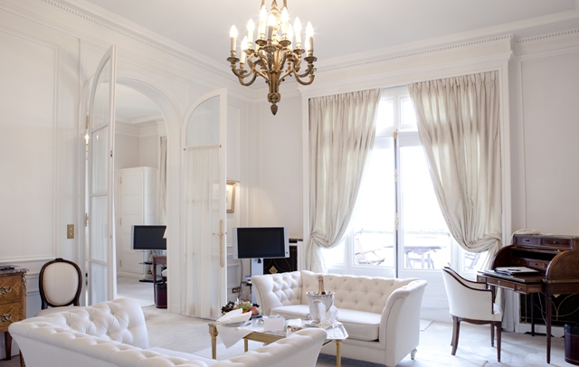
The interiors of a hotel are always to be warm and inviting in feel, traditional and conservative in style, and utilize bright rich contrasting colors. Maintaining consistency is critical in order to provide guests with the level of comfort and product quality they expect from a top of the line hotel.
Public Space
In the public space the “look and feel” is achieved through a consistent approach to basic design guidelines for flooring, walls, ceilings millwork, detailing, furnishings, colour, and product durability.
Flooring: is a combination of patterned stone work and rich carpeting. Selected stone is always warm in color, never cold. Carpets feature grand traditionally based patterns colored in clear, bright, warm colors. Patterns should not be abstract, contemporary or solely geometric and should not have delicate colors. Colors are positioned carefully to create contrast and distinct patterns that are both beautiful and durable.
Millwork: Throughout the Public space, provide a combination of rich millwork, wallcoverings, and window treatments. Use substantial quantities of millwork in proper proportions in order to bring warmth to the space and to create a degree of grandeur within scale.
Window Treatments and Wallcoverings: These elements evolve from more traditional, grand residential styles and patterns and are selected and applied carefully to ensure durability and longevity.
Metalwork: Whenever metal finishes are used, provide warm-colored metals such as bronze. In principle, do not use bright cold metals such as chrome.
Lighting: To complete the look, use table lamps extensively to provide inviting intimate task-level incandescent lighting for added warmth and a more human, comfortable scale (avoid waste of energy and avoid reading lights from the ceiling in the bed rooms).
Ceilings: Treat as an extension of the walls and incorporate coffers, multi-leveled treatments and millwork detailing. Decorative lighting is also a consistent part of the décor.
Furnishings: For the Public spaces, impart a warm, refined, yet comfortable look. They too draw from traditional, grand residential styles and patterns.
Furniture: Combination of warm finishes and rich upholsteries such as leather, tapestries and other durable materials.
Although the look must be residential, the quality and construction of goods must be suitable for heavy use sustained in hotel public areas.
The colors used in the fabrics are bright, warm and clear – never cold, muted, grayed, earth tone or fragile. Colors should be combined carefully to create contrast. (Avoid black or dark/black colors as much as possible and fabrics to be durable).
Guest Rooms and Suites
Guest Rooms and Suites are designed to offer distinct working, grooming, relaxing, and sleeping zones with good soundproof while maintaining a comfortable yet durable residential atmosphere.
Always avoid sharp corners throughout the rooms and bathrooms and must use fire retardant materials.
Carpeting: Distinct small scale pattern consisting of a minimum of two colors. These colors should provide a strong contrast for durability utilizing bright, warm clear colors. Cold, muted, grayed earth tone or fragile colors are not used.
Walls: Finish in a durable, but residential style light colored vinyl wall covering and generous scale crown and base moldings.
Window Treatments: Traditional residential styles with blackout lining (yet comply with modern architecture) and are light in color to keep rooms cheerful and bright in color.
Casegoods: Originate from traditional styles and built with durability in mind for contract use. Consider quality glass top for working desk, coffee table and bedside tables.
The bedspread or the duvet is the focal point of the room and should feature a clean/crispy inviting feeling.
Work station furniture coordinates aesthetically with the other case pieces and follows brand guidelines for required features. Latest IT and power connectivity and proper lightings a must.
Upholstery fabrics are durable in color, pattern and texture. Desk chairs are upholstered in high quality vinyl, leather or strong fabric and preferably on wheels.
Luggage rack: always have a good size fixed luggage rack perhaps with drawers on the lower part (plus a foldable rack in the closet is highly recommended)
Artwork: Realistic in subject matter; abstract or extreme contemporary styles should not be used. Utilize wall space above the headboard for a large and attractive artwork in line with the country/location and culture.
Headboard: Practical and washable.
Full Length Mirror; strategically placed and avoid reflection from the bed.
Mini Bar; Avoid placing the mini bar cabinet in the middle of the room under the TV. Mini Bar wall cabinet and shelves should be placed close to the closet. Proper drawers, shelves and ventilation for the mini bar motor to be provided.
Bathrooms: Never too dark, must have adequate lighting for make-up/shave. Can use a combination of light stone and vinyl for walls (or all stone). Importance of non slippery floors, easy to use shower and wash basin controls/mixers, good size mirror, always have amenities shelves in wash basin and shower, efficient drainage, safety grab-bars in shower and bath-tab, sufficient hooks, cloth line, magnifying mirror, safety-type hair dryer, comfortable toilet seat, etc. Avoid mosaic walls/floors in wet areas, also no gaps between marble/hard floor tiles (avoid accumulation of mildew).
Make it easy for the customer: simple to understand and use, i.e. light switches with master, electronic controls i.e. TV, telephone, cloak, location of sockets, sufficient flat-tops, proper luggage rack, sufficient cloth hangers, a non complicated electronic safe, and most important efficient internet connectivity and adequate place to work.
Must remember that there are times when a designer dream becomes a customer/operator nightmare.

